Followers

Sunday, August 29, 2010

Gruesome Twosome Layout

Hey there everyone...I just finished this layout last night. It is my submission for the Cricut messgageboard LID challenge for the week of 8/21-8/27 and can be found HERE.  The sketch is from Scrapbooks Etc.


The papers used in this layout all come from the new DCWV stacks called Midnight Spell which can be purchased at JoAnn fabrics.  I got mine for a steal...they had them on sale for 9.99 and I used a Michael's 20% your entire purchase coupon so that I got these stacks for EIGHT bucks!!!  Yay!


This little witch was made using the Paper Doll Dress Up Cricut cartridge.  I cut out the witch's accessories and added an apron from the pilgrim page.  I also cut the witch's dress a second time in green so that I could mimic the green ruffle at the bottom of my daughter's costume.  The orange accents are Stickles.


The headstones come from the Happy Hauntings Cricut cartridge.  I added the RIP using Sakura Glaze pens and some black Stickles for the eyes of the skull.


This was a rub on I got in Target's dollar spot last year around this time.  The dots are flat backed pearls.


The word gruesome is also cut from Cricut's Happy Hauntings cartridge.  I think I stretched the height a bit using my Gypsy.  The word twosome is from Cricut's Stamped cartridge.  This is actually the first time I 've used that cartridge.  I know it's not most people's favorite, but the font is really awesome for Halloween layouts.


Here is a close up of my journaling.  The shape it is on is from the Storybook Cricut cartridge.


Thanks for coming to check out my page!  If you have any questions about anything...don't be a stranger :)  Have a great day!!!

Friday, August 27, 2010

Better late than never!

Here is a layout I've been working on for oh...about three weeks now. I got stuck and had to leave it sit for awhile before I could come back to it...I'm goofy like that sometimes. There are times when I know a layout needs more, but I just can't figure out what. When I leave it awhile and come back to it, I end up coming up with an idea I'm happy with.

It's a layout of my daughter's first friend birthday party last year-what a crazy day that was!  I've used a little sparkly magic to block out her friends' faces in the interest of their privacy.  I thought it would be cuter than laying big white squares of cardstock over their faces before photographing :)


Most of the papers used came from the Peace, Love, Happiness by the Paper Studio which can be purchased at Hobby Lobby.  The pink flowery papers are from a smaller stack I recently picked up at Tuesday Morning for 2 bucks.  I'm not sure what brand though...


Here's the side that was for the LID challenge and HERE is where you can find the original sketch on the Cricut message board.  Once again, I had more pictures than the layout called for, so I improvised.  I cut file folders from the Fabulous Finds Cricut cartridge and fashioned little pockets to hold inserts that hold and extra photo and journaling.  The little embellies on the tab serve almost as handles so the inserts can be pulled out more easily.


This little slice of cake (as well as the die cut gifts) wwere cut out from the Sweet Treats cartridge.  I added some white gel pen to make it pop as well as a "cherry" rhinestone.  I attached the cake to the insert with a pop dot.


Banners seem to be all the rage now, so I gave it a whirl.  These pieced were cut from the Celebrations cartridge.  Very cute!!! 

The black, starry background paper was cut using the Gypsy Wanderings cartridge.


It's hard to tell in this photo, but the journaling lines and brackets are raised and glittery.  They came in a pack of rubons I picked up at Big Lots recently for $1.50.  I added the white faux stitching and rhinestones.


And here's my title.  The birthday word is a K & Company sticker.  The yellow blast shape is from the Batman Cricut cartridge.  I manipulated it into this specific shape using my Gypsy.  The font is from Hannah Montana.

Thanks for checking out my page!  Have a good one! :)

Saturday, August 21, 2010

Cutest Pumkin in the Patch Layout

This is a layout I did for the Cricut messageboard LID challenge.  I've been waiting for a way to perfectly display these photos of my son from last year and once I saw the sketch, I knew they would be a perfect fit!  The sketch can be found HERE.

The striped paper in the background comes from a Heidi Grace page kit I found at Big Lots.  Actually, a lot of the elements of this page are Heidi Grace.  The rest of the papers, including the glitter paper come from the DCWV Bon Voyage cardstock stack.  I just LOVE the earthy colors of that stack!

I had a lot of fun but just a little frustration making the title for my page.  All of the words except for "pumpkin" are Heidi Grace rub ons.  The small letters kept moving on me so this was actually my second attempt at my title.  The first one came out cute, but the letters were all messed up so I had to go back to the drawing board!

I cut each circle out and inked the edges with a Chestnut Roan Cat's Eye chalk ink pad.  The brown circle was run through my Sizzix purse with a Cuttlebug Distressed Stripes embossing folder.  Then I added the rubons, added the green felt Thickers lettering, and attached the Heidi Grace flowers with a coordinating brad.


I wanted to add more pics but since the sketch only called for two, I made my page a little interactive.  I added this tab so that we can flip to the other pictures.  The tab was cut from the Fabulous Finds Cricut cartridge and the 'loveable' chipboard sticker is from Heidi Grace.


Here's what it looks like when you flip to see the extra photos.  I always seem to get a lot of great shots and I would hate for them to get lost in the shuffle, so hiding photos like this in a scrapbook page is a great way to add them while not distracting from the original sketch. 


The scalloped border at the bottom was created using a little bit of welding and my Gypsy.  The green strip and the beige strip of paper were crimped using my Fiskars paper crimper.  I like the texture it adds.

Well, that about does it!  Thanks for checking out my page.  See you soon :)

Tuesday, August 17, 2010

Please come vote for me...

Hi everyone!  I entered a contest to win a Slice machine.  The winner with the most votes for their layout wins.  I entered my recent fall layout.  If you don't mind, stop on by and vote for me :)  You can vote once a day.

Thanks so much!!!

Please vote HERE :)

Monday, August 16, 2010

Giveaway winner!!!

Congratulations to Shelly who wrote "Have to love a give away! Thanks for the chance to win and congrats on the milestone! Here's to MANY more followers..."

I used random.org for the drawing.


Shelly was lucky #7!!!  Congratulations!  I'll email you to get your information and I'll send out your goodies as soon as possible!
 
 
Thanks to all who entered my giveaway.  I hope to do more in the future, so stay on the lookout!
 
Have a great day everyone!
 
-TraciVee

Friday, August 6, 2010

Creeping up on 100...time for a giveaway!!!


I started actively posting to my blog back in February and I am SO excited to finally be within reach of 100 followers! 

To celebrate this momentous occasion, I have some goodies to share with a lucky someone.  Here's what I have to offer:

One pack Tim Holtz grungeboard (dot textured)

One Martha Stewart Hearts & Flowers clear stamp set

One Martha Stewart alphabet clear stamp set

One Martha Stewart Dinner Party clear stamp set

One Martha Stewart New Baby clear stamp set


One pink Cutterfly scrapbooking multi-tool

Three spools of rick-rack


All you have to do to be entered in my giveaway is to sign up to follow my blog and leave a comment on this post.  On Monday, August 16, 2010 I'll pick a winner using random.org.  Please make sure to leave some kind of a way for me to contact you if you should win.  This can be an email address, or Cricut.com messageboard name, or anything...I just have to be able to tell you the good news :)

Good luck everyone!


I can't wait for fall!!!


Here is yet another LID challenge.  I really love doing these, the sketches are always great and they really help to keep me motivated and focused! 

This is probably my favorite layout that I've ever done.  I just really like how it all came out with the colors, the textures, the photos...I just love it all!


For this layout, I used the new Autum DCWV stacks that came from Michael's.  I liked the ones there a little better than the fall stacks JoAnn's had.

The title was created using the Nursery Rhymes Cricut cartridge.  I welded the letters and manipulated them to look a little more whimsical.  The word pickin was made using Stickopotamus letters I picked up at WalMart for a buck.  I adhered them to a cardstock rectangle, inked the edges, and then fastened some ribbon scraps to the ends using decorative rust colored staples. 


This shape is so gorgeous!  It comes from the Cricut seasonal mini cartridge called October 31st.  There is no function to layer since it's a mini cart, so I just inked the vines in brown so that the shape could be a little more detailed.  Also, when cutting this shape out, make sure you use a low pressure setting and multicut 3 times.  This shape is very delicate and can easily be shredded if the proper settings are not used.  Trust me-I learned the hard way! LOL


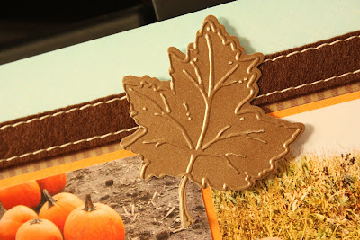
The leaves were created using the Cuttlebug cut and emboss sets.  I picked these up at Big Lots a couple months ago when they were selling for 2 bucks.  The leaves are just beautiful.  The orange one was inked a little to bring out the veins, but the brown one is made from a shimmer paper which didn't hold ink well.

The ribbon is very thick, almost like a wooly material.  I picked it up at Christmas time last year from Michael's after Christmas sale for a buck.  I hope they put out more this year because I want some more of it!


This family embellishment is actually from Target's dollar spot.  Last year they were selling a little pack of chipboard shapes that were fall themed.  They are so pretty and come in orange, green, yellow and brown with gold foil accents.  You'd be amazed that the great scrap stuff you can pick up for a buck!

Once again, thanks for checking out my layout.  I hope it inspired you in one way or another :)

Baby Layout


Here's another layout I did for the LID challenge on the Cricut messageboard.  This layout was also made using the DCWV spring stack...I am totally getting my money's worth out of this stack!  I've already made about 5 layouts and a couple of cards using this stack.

In this piece, I cut the grass out using Plantin Schoolbook.  I welded three grass cuts together and cut it out twice.  Thank I inked it all (yes, every....single....blade...of...grass...on....both...sides) which took forever and then layered both images to give it a very dimensional effect.  I think it looks cool, so my time was well spent :)


The title was created using Simply Sweet, Nursery Rhymes, New Arrival, and Holiday Cakes.   For the word, grassy, I spelled it out using Simply Sweet.  Using my Gypsy, I shortened and stretched and manipulated the size of the letters until I achieved my desired effect.

The words little baby are from Nursery Rhymes.  The image had a heart between the two words that couldn't be hidden with the hide contour feature, so I just cut out the whole word and then snipped the heart out by hand.

The word feet was made using Holiday Cakes and I welded it and stretched it a little with my Gypsy.  It's amazing how you can achieve the look of a totally different font by just playing around with your sizes using the Gypsy.  That is the best money I've ever spent....

The feet were cut from the New Arrival cartridge.

Thanks for looking at my layout!  Have a great day :)

Running through the sprinkler Layout

Here is a layout I made to participate in the Cricut messageboard LID weekly challenge.  I used the DCWV Spring paper stack because I thought it would go well with the bright, summery colors that were contained in the photographs.

The title was cut from the new fall mini Cricut cart called H2O.  It is a very delicate cut, so I cut it using medium pressure and multicut 3.  The sun image is from Create a Critter.  I inked the edges of the sun image.  I wanted to ink the title as well....but life is just too short....LOL!


This little do-dad was created by cutting out this shape from a piece of paper (the paper had all kinds of words on it) from the spring stack and using a little Glossy Accents to make an epoxy embellishment.  It's the first time I've used that product and I was really happy with the results!  The shine from the epoxy makes it look as if the piece is wet, which is pretty cool considering my subject matter.


The journaling was computer generated for this piece.  I've been doing this a lot lately not because I don't like my handwriting, but because I can't write straight! lol  My sentences always end up slanted :(

The sprinkler shape was cut using the H2O Cricut cartridge.  I wanted bigger water droplets, so I looked through my stash to see what I could come up with.  I ended up finding a rhinestone flower and broke each petal off in order to make droplet shapes.  It was not easy, let me tell ya!  After breaking the petals off, the edges were very jagged, but a couple of quick swipes with an emery board did the trick.

That's my project, I hope you all enjoyed looking at it and might be able to snag an idea or two from it :)